Top 5 iconic logos and their beautiful stories
Beauty makes us reach decisions quicker. The professionals from EVAlab in Vienna (Austria) consider that the human brain is the first to notice the beauty. The thinking process takes up too much brain energy, so in order to save it, the brain takes the path of least resistance and makes decisions rapidly. Eventually, we choose beauty and simplicity.
Here are Top 5 iconic logotypes that you definitely know. They are successful stories of world-known companies and how with the help of beautiful logos, they influence us.
Mastercard
Mastercard is absolutely in the lead when we talk about the most recognizable logos. In 2019 Mastercard renewed its logo, i.e. dropped its name from the logotype. Raja Rajamannar, chief marketing and communication officer at Mastercard, explained at the press release why they did it:
Starbucks
Starbucks is more than just great coffee! It's also one of the greatest world logos with ancient roots. The Siren from the Starbucks logotype was born in the 7-th c. in Italy. The twin-tailed mermaid mosaic that inspired the company owner can be found in the Pesaro Cathedral.
Long time ago, it was a symbol of uniting humans and nature. Nowadays it has transformed into a powerful symbol of globalization. According to the Starbucks website, the mermaid’s or the siren’s image on your coffee cup might “capture the seafaring history of coffee and Seattle’s strong seaport roots”. This beautiful story makes an awesome logo.
Apple
We all know the iconic logo of a bitten apple. It became a symbol of good quality and privileged social status. The Apple logotype created by Rob Janoff in 1977, and this bitten apple has been the logo of the brand ever since. Its power is in its simplicity.
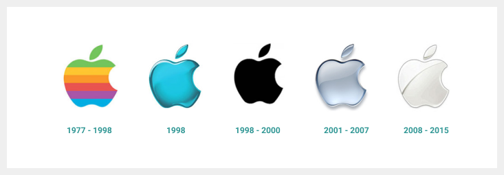
Below you can see the evolution of the logo from a rainbow version to a modern monochromatic style. Nowadays, the logo comes mainly in 3 colours - silver, white, and black. Apple has never put information about its company name in the logotype. The logo itself tells it all, which is the best example of strong identity.
FedEx
The phenomenon of FedEx logotype is known even to the lazy one. Just relax, look at the logo, and enjoy a miracle - you’ll see an arrow! The logotype was designed in 1994 by Lindon Leader, Landor Associates. He used the principle of optical illusion. This practice of hiding elements was very popular in the 1970s (for example, a bear hidden in the Toblerone logo) and is common to all visual communications. Sometimes old doesn't mean archaic. Lindon didn't try to catch the flow - FedEx shows us stability, that's why it became iconic.
Yamato
And the last logo can be the cutest one on this list - Yamato Transport Company logo. You are right, it is because of cats on it. This is Japan’s largest door-to-door delivery service company that also works in Europe and the US. The mother cat carrying the kitten in her mouth symbolizes the promise that items entrusted to Yamato for shipping or moving will be treated with the utmost care. Isn't it sweet and beautiful?
So if you are just making your first steps in developing and branding a company, take care of the beauty and simplicity of your logotype. And remember - people like stories!
Follow author on facebook Mariana Zaklinska.More From iMockups:
Free mockups: 12 websites for downloading free mockups for photoshop.
Best resources where you can download free psd mockup and other graphics for your design projects!