TOP 5 Pagination UI Design
We have collected some cool examples to make beautiful pagination UI design better or inspire you for a new one! I hope this collection will be useful to you and save you time looking for the best solution.
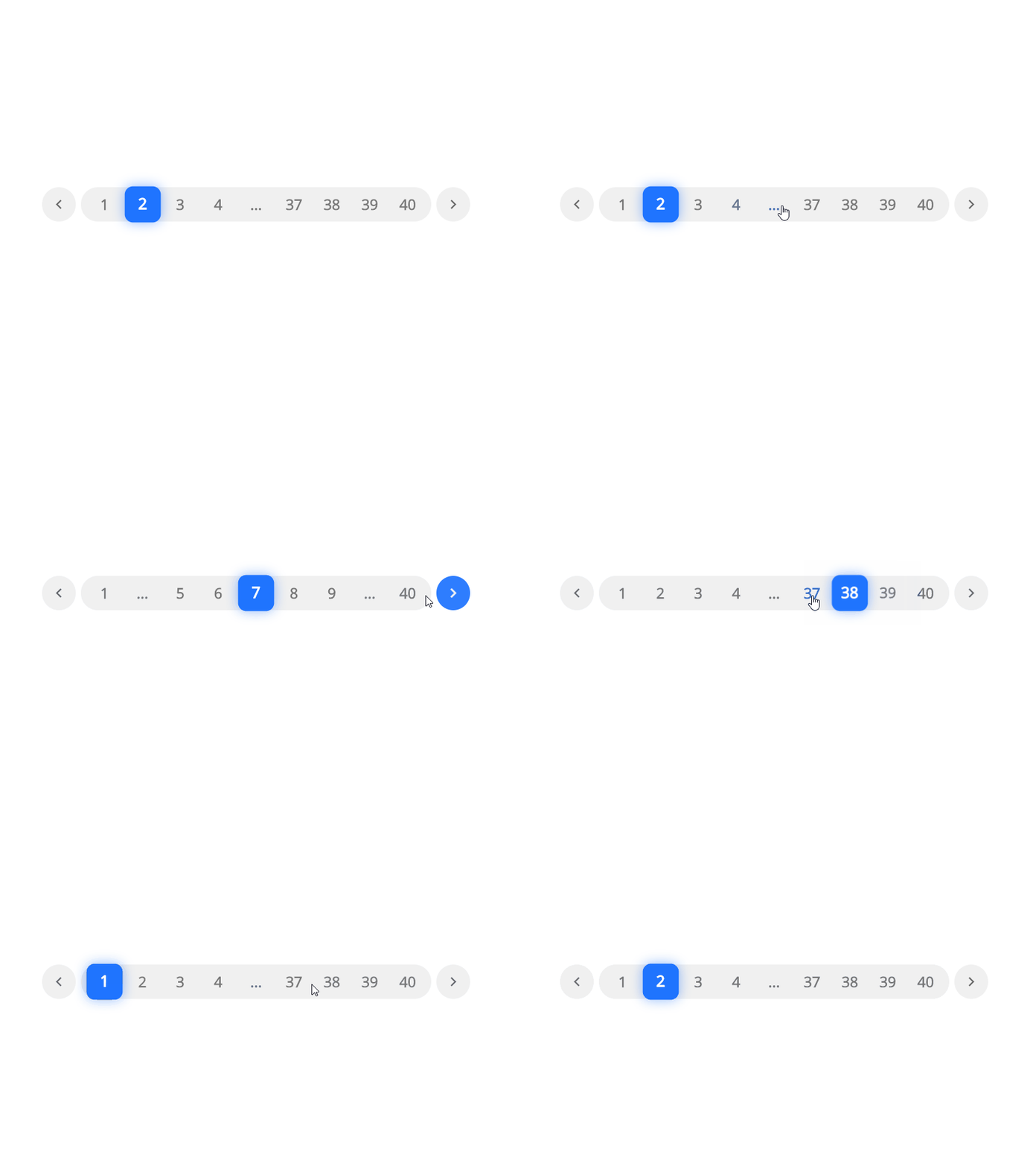
Hidden pre-hover navigation

An interesting option for pagination. I love the clean and interactive approach that the author of this great concept showed us! I think on mobile devices it will be necessary to think over a different approach, perhaps without side arrows, but for desktop it is a very good option, from the point of view of UI.
Here is the implemented concept by Mourad Hamoud.
https://codepen.io/mouradhamoud/pen/rrNrVp
Vuesax Pagination

I have a lot of positive emotions from this concept! I think it will suit almost every project and will be a great addition to any design system! A well-designed switch makes it possible to move from one page to another without difficulty! I also like the shadow effect. Super!
Demo and documents:
https://lusaxweb.github.io/vuesax/components/pagination.html
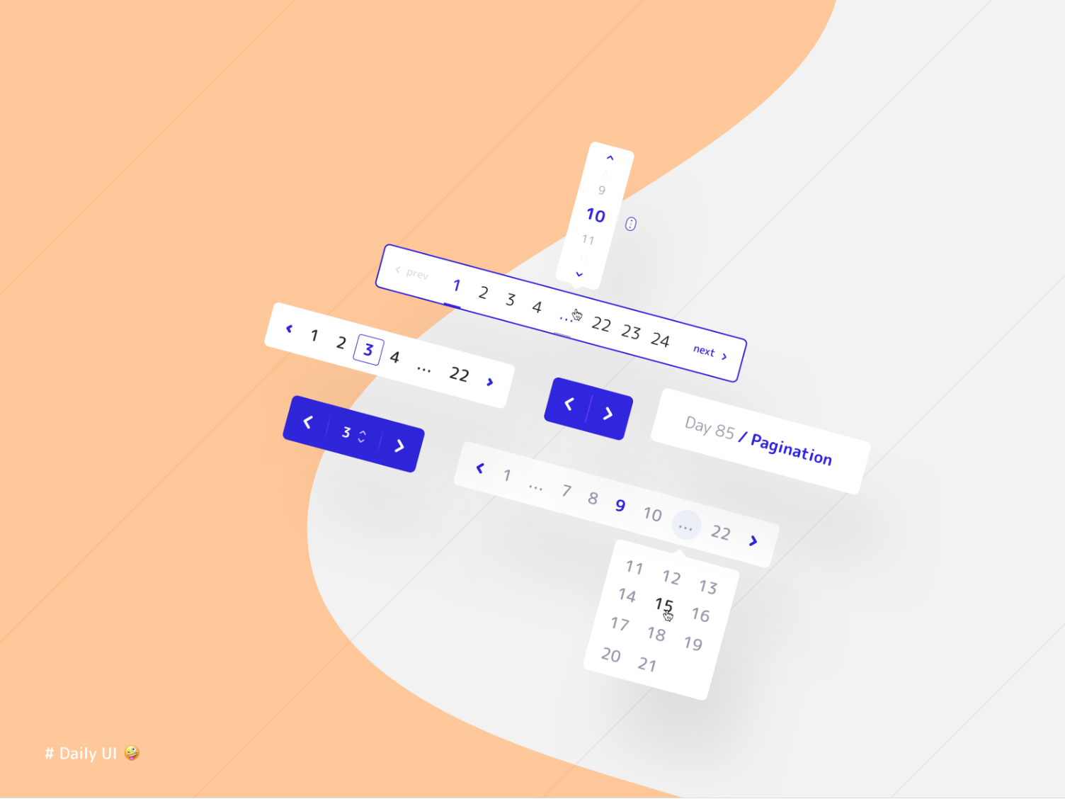
Vuesax Pagination

Another good concept, even a whole set of pagination. For mobile, tablet and desktop versions! Nice and stylish! You can safely take this to the mood board!
Concept by SergeySuper Animated

Interactive lovers will probably drool here! Not sure if this concept will fit every project or system! Design animations are inspired by the approach for other elements!
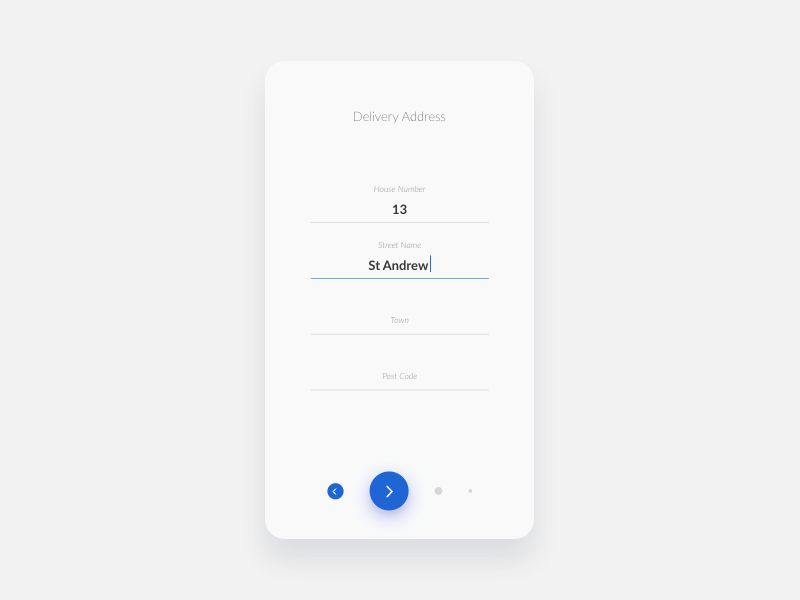
Animation concept by RomanShort Pagination


And finally! Moving away from the standard pagination, let's see the next concept! I think this is more suitable for unboarding! And there is no doubt that he is good! In the mobile version, I think it will also have a great effect! Nice animation.
Concept by Jānis KormisIn conclusion, I want to say that the best pagination approach is the one that will allow you to achieve your goals! If you have a multi-select in your system, think about showing all posts. If you need to quickly move from page to page, make the "next" button bigger! If page numbering is not important and you have a news resource, do the loading of elements when scrolling! Good luck, and never turn the page back in your life!?!
More From iMockups:
Top 5 iconic logos and their beautiful stories
Successful stories of world-known companies and how with the help of beautiful logos, they influence us.
Free mockups: 12 websites for downloading free mockups for photoshop.
Best resources where you can download free psd mockup and other graphics for your design projects!